A Danish vanilla brand and sister label to
a top-tier premium vanilla house, positioned deliberately
as the value-based alternative.
I was asked to take a look
at their branding, building
upon a few elements
they’d already experimented
with as a starting point.
They were working with cyan and magenta tones as brand colors,
and instead of using these colors as solids, I suggested using them
as a distinctive stripe, weaving everything together.
Originally, I just helped tighten up an existing
logo sketch, but I couldn’t resist trying to give
it an extra dimension by turning to code.
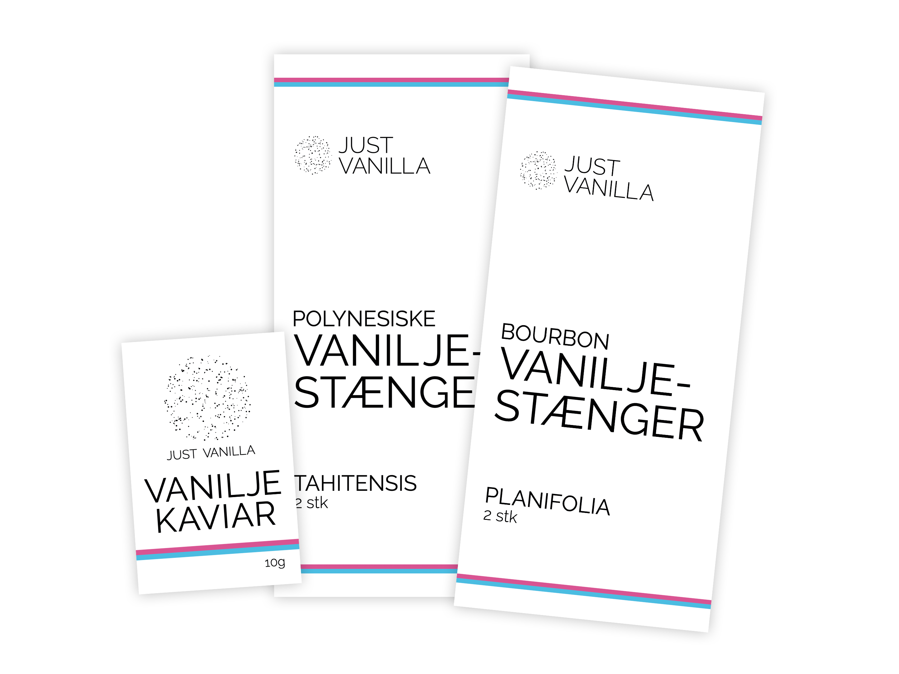
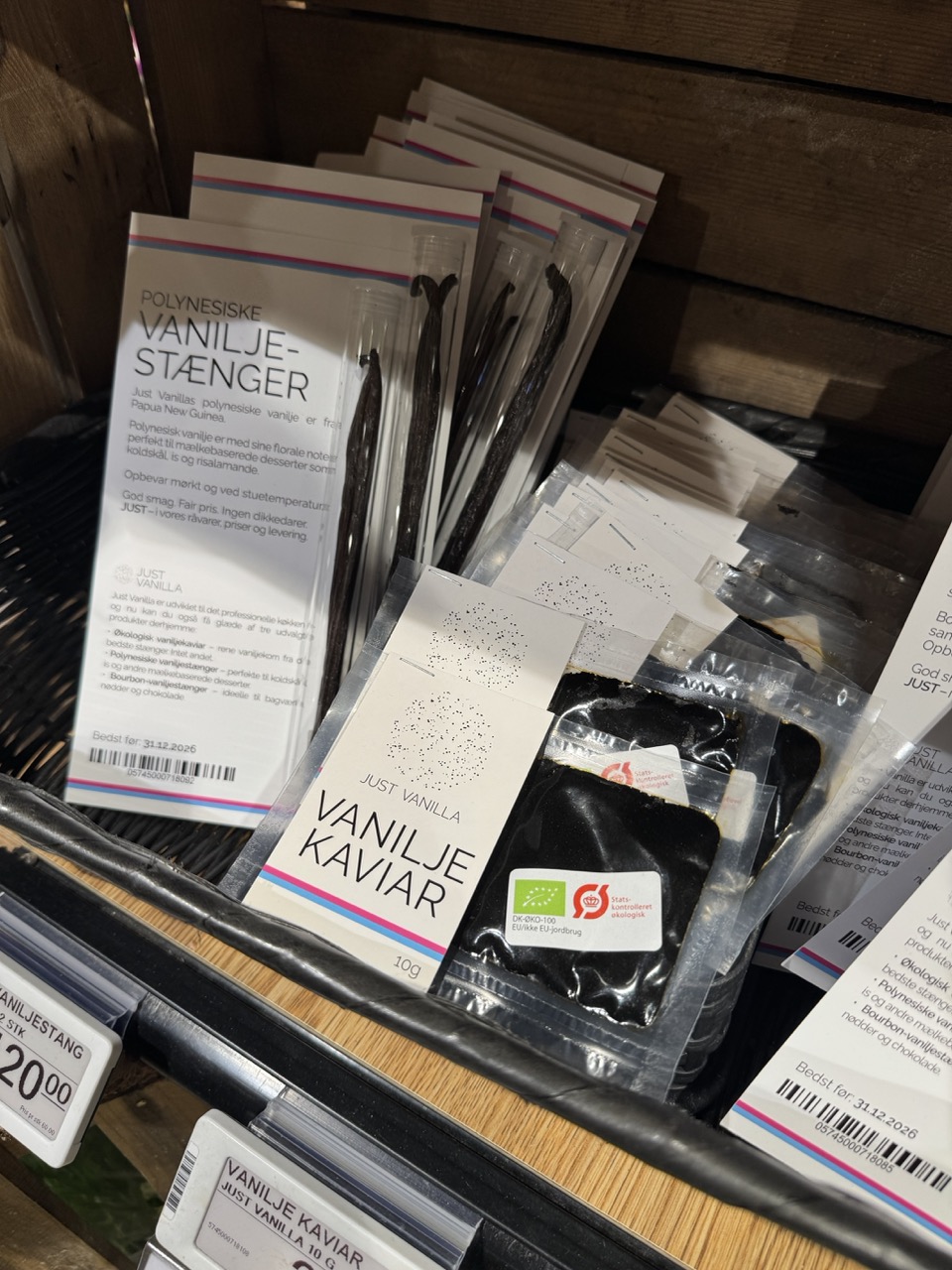
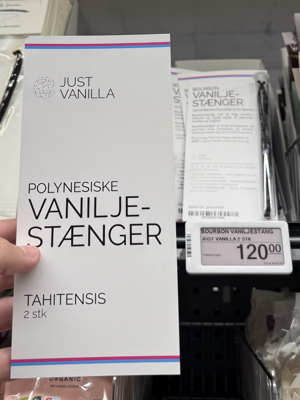
From there, the project also grew into
my first commercial packaging design.
© Karl Bager 2026